No code, no problem: introduction to working with ArcGIS Experience Builder
Want to build a web app but not sure where to start? You’ve come to the right place! ArcGIS Experience Builder offers a streamlined and structured way to build your dream web app without any coding. In our recent webinar, we walked you through 6 steps to build your first web app, this blog will break down every step in detail.
Introduction
ArcGIS Experience Builder allows users to create custom web applications using an intuitive, drag-and-drop interface without needing to write any code. Before we dive into building, we first need to think about the purpose of our app. What functions do we want our application to have? How do we want it to look? Is this going to be a simple app for public consumption or a more complex app for internal use?
TIP: Plan out what functionalities you want your Experience to have before you jump into creating one!
Taking time to plan out what functionalities your Experience will need allows you to choose whether you want to create your Experience in Express Mode or Full Mode. Esri created Express Mode to offer a simple, template-based solution to create highly configurable web applications. To help you decide which mode you should choose for your Experience, check out Beyond Web AppBuilder: A New Experience in App Building.
For the remainder of this blog, I will guide you through how to create your Experience in Express Mode following 6 easy steps:
-
Choose a template
-
Choose a theme
-
Select source data
-
Add/connect widgets
-
Refine layouts for all devices
-
Save, preview and publish
To access Express Mode within ArcGIS Experience Builder, you must ensure to toggle the mode selector in the upper right to Express Mode. From there, you can click Create New which will bring us to our first step in creating our Experience.

Step 1: Choose a template
Express mode currently offers 9 different templates for you to choose from. From this page you are able to toggle between each of the templates to interact with all of the features that they offer. This page also allows you to preview what each of these templates would look like on large, medium and small screen devices.
Choosing your template should be a breeze now that you have planned out exactly what functionality you want your Experience to have. Each of the 9 templates have a combination of different features that will help you to meet these needs. The following features can be found within the Express Mode templates:
-
Header / Logo - Allows you to add your organizations branding to your application
-
Table - Interactive attribute tables for the data within your application
-
Buttons - Provide links to open pages, windows and section views in your app, scroll to a particular block or to the top of the page or go to a web address.
-
Containers - Spots for widgets that are permanently open on your application
-
Widget Controller - Allows you to add widgets to a toolbar. Users can open and close the widgets as needed.
-
Search Widget - Search tool that allows users to find features, records or locations
TIP: Once you choose a template for your Experience you are unable to change it!

Step 2: Choose a theme
To choose a theme for your Experience you will need to open up the Theme Gallery. You can choose from one of the preset themes that come with Experience Builder, use your organizations shared theme or even customize the colours and fonts yourself!
TIP: Changing the theme font size does NOT change the header font size – this must be changed manually by selecting the header text box.

Step 3: Select source data
You can add source data using the Map widget Configuration Panel. The configuration panel can be found on the right side of the builder when a widget is selected. To bring up this panel all you have to do is select the Map widget within your Experience. To add your source data, click on “Select Map”.
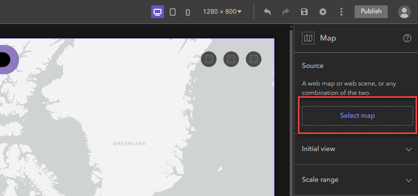
Location of the “Select map” button within the Map Configuration Panel
From here the Select data panel will appear. At the bottom of this panel click on “Add new map or scene”.
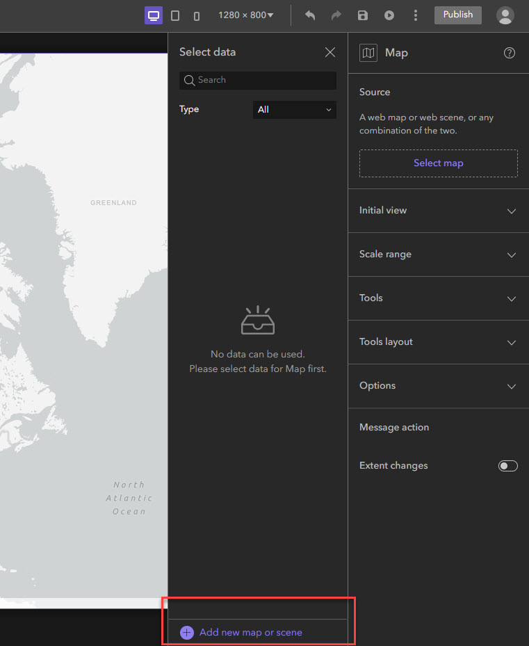
Location of the “Add new map or scene” button within the Select Data panel
This will bring up the Add Data page where you can choose which web maps and web scenes that you would like to include within your Experience. You will be able to choose content from your groups, organization, ArcGIS Online, the Living Atlas and your personal content.
Once you’ve selected your data it will appear within the Select Data panel. If your data does not automatically appear within your map widget you can select it from the panel.
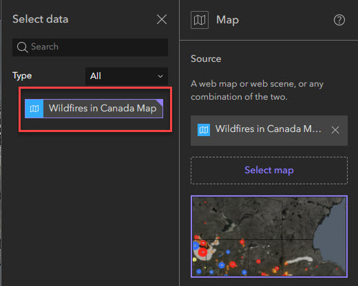
Location of where your data will appear within the Select data panel
If you would like to set an initial view for your map or add tools like a compass or scale bar, you can do this within the Map widget configuration panel. From this panel you can even choose to enable pop-ups and scroll zooming!
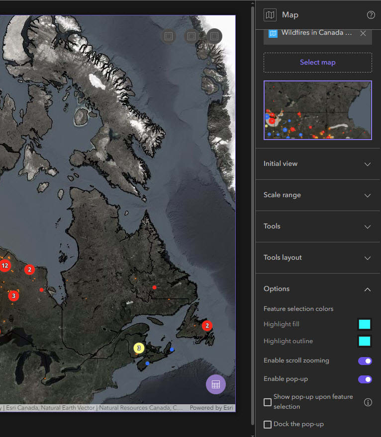
Map widget configuration panel customization options
Step 4: Add / connect widgets
Express Mode allows you to add widgets in two different ways depending on which template you’ve chosen. Widgets can be added to widget controllers or to widget containers. Either way, the process is similar – select the widget controller / container and the Add widget (+) button will appear in the builder toolbar.
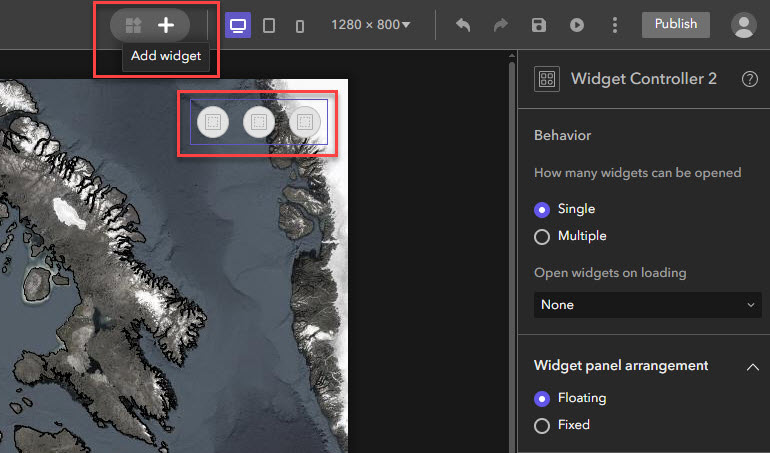
Adding a widget to a widget controller
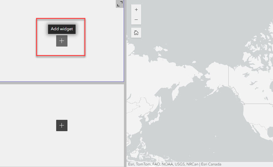
Adding a widget to a widget container
Once you select the “Add widget” button, the Add widget gallery will appear. Here you can scroll through and select a widget from the gallery or search for the widget you want.
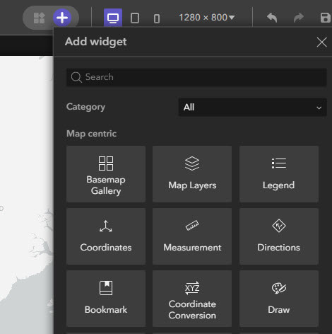
Location of the Add widget gallery
After you select a widget, it will appear within the widget controller / container that you selected originally. Now that you have placed a widget you will have access to manage and delete widgets. Managing widgets allows you to change the order in which they appear in your widget controller. To delete a widget, make sure you have it selected and then click the delete button.
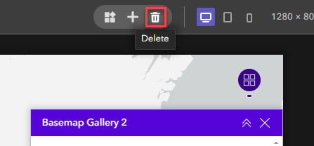
Location of the delete button
Step 5: Refine layouts for all devices
Now that we have connected and configured all of our widgets we are almost done with the creation of our Experience! The second last step is to ensure our applications works as intended on all screen sizes. This is made easy in Experience Builder as you are able to toggle between different screen sizes. To access a preview of your application on different screen sizes, you simply select the screen size you want from the builder toolbar.
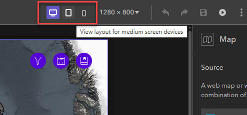
Changing the view layout of your app to a different screen size
In Express Mode you are unable to make changes to the medium and small screen sizes, only the large. Luckily Experience Builder will automatically adjust your application to fit the dimensions of the medium and small screen sizes. If you wish to make changes to the medium and small screen versions of your application, you will have to switch your application to Full Mode.
TIP: You can switch your application into Full Mode by clicking on the “More” button in the Builder toolbar. You can then select “Switch to full mode”. Once you switch your application to Full Mode you are not able to change it back! It is a good idea to move a copy of your application over to Full Mode so that you have your original Express Mode version to fall back on if needed.
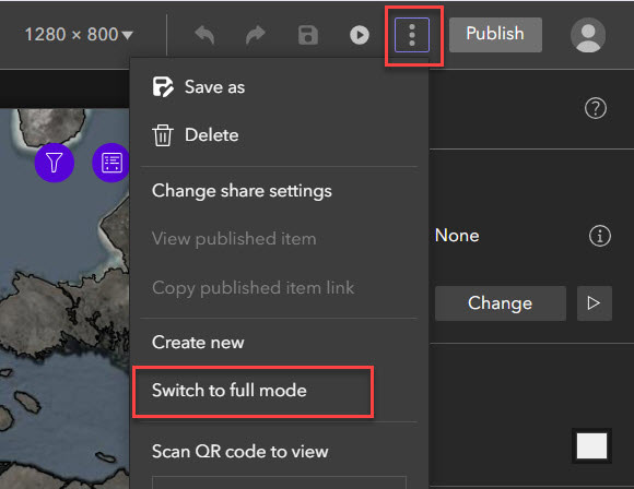
Location of the “More” button within the builder toolbar which gives you the option to switch your app to full mode
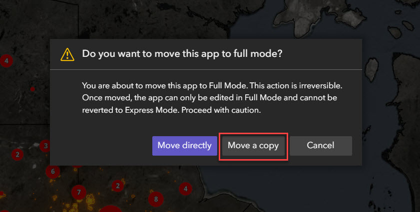
Make a copy of your app so you always have a backup
Step 6: Save, preview and publish
Once you are happy with your app, you can save, preview and publish it from the builder toolbar.

After completing these 6 simple steps your Experience is ready to go!
In this blog we have covered the basics, if you want to expand your Experience Builder knowledge, check out part 2 of this blog series: No code no problem: Advanced configurations in Experience Builder.