A guide to producing more powerful popups with ArcGIS Arcade
ArcGIS Arcade is a simple programming language designed to add functionality to different aspects of ArcGIS. In this guide from certified ArcGIS instructor Ray Caron, discover how you can use it to add figures, tables, lists, dynamically coloured text and data aggregation and calculation capabilities to the popups in your web map.
The key takeaway
- You can use the ArcGIS Arcade expression language to add helpful context to your ArcGIS web app’s popups. Use it to present coordinates in different formats, add dynamic tables and lists powered by calculations and arguments, colour tables, lists and text dynamically based on attribute values or categories, add horizontal or vertical bar charts that reference attributes and attribute expressions, and much more. And if you’ve still got questions after reading our guide, Esri Canada has two instructor-led courses on Arcade, in which our certified ArcGIS instructors will take you to greater depths and guide you through tailored exercises.
ArcGIS Arcade is a simple programming language designed to add functionality to different aspects of ArcGIS, and will work across the ArcGIS system. It’s designed to work within a range of profiles to provide functionality. This article will highlight some features of Arcade that can help you better communicate and synthesize information, use calculations and present information in Arcade-driven popups.
Use the popups profile in Arcade to augment your popups with context
Arcade has 25 different profiles. Each profile addresses a specific operation. Arcade provides several functions that can be used to customize, fetch or calculate and then present information within each of these profiles. The examples that are shown here involve the popups profile.
Popups provide context about specific map features and can display attribute data, images, charts, multimedia and Arcade-designed elements. They are available in ArcGIS Pro, ArcGIS AllSource, ArcGIS Enterprise, ArcGIS Online and the ArcGIS Maps SDKs. Arcade expands the possibilities of what can go into a popup, whether that’s data fetched from other feature classes, calculations, dynamically coloured text, custom lists and tables, formatted attribute table entries, bar graphs and much more.
The Arcade popup element vs the popup attribute expression
There are two different types of popup data presentations that you can use Arcade for. First, there’s the Arcade popup element, which requires that Arcade code return data in a dictionary format. There’s also the popup Attribute expression, which requires a return using simple text, numbers or dates. The dictionary can be formatted using HTML to present horizontal or vertical bar graphs, a list or a table, whereas the Attribute expression can be embedded in other popup elements like a field list, a block of text or a chart element.
Use popups to present locations in different coordinate formats
Any feature on your map, even a moving point feature tracked in real time, can have its location presented in a popup. You can do this with an attribute expression and add it to a text popup or an attribute table, and you can choose to present its location in WGS84 Web Mercator metres or as WGS84 DD or DMS. If you add a different datum and projection to the attribute table of a feature layer, you can present those coordinates as well. (See Figure 1.)

Figure 1: Use Arcade with your popups to dynamically show the current locations of moving points, such as ships.
You can also choose to present this information as an Arcade popup element and show it as a line of text, a list or present it as a table. You can also program an Arcade element to expand a table layout to include additional columns by formatting the dictionary returned by the Arcade code using HTML.
Use Arcade to add dynamic tables and lists to your popups
Since an Arcade popup element is able to support a dictionary, and since simple HTML code is also supported, it is possible to construct a custom table and present it within a popup. You can use Arcade to perform calculations and construct arguments, then use HTML to build the table and modify the presented text and colours.
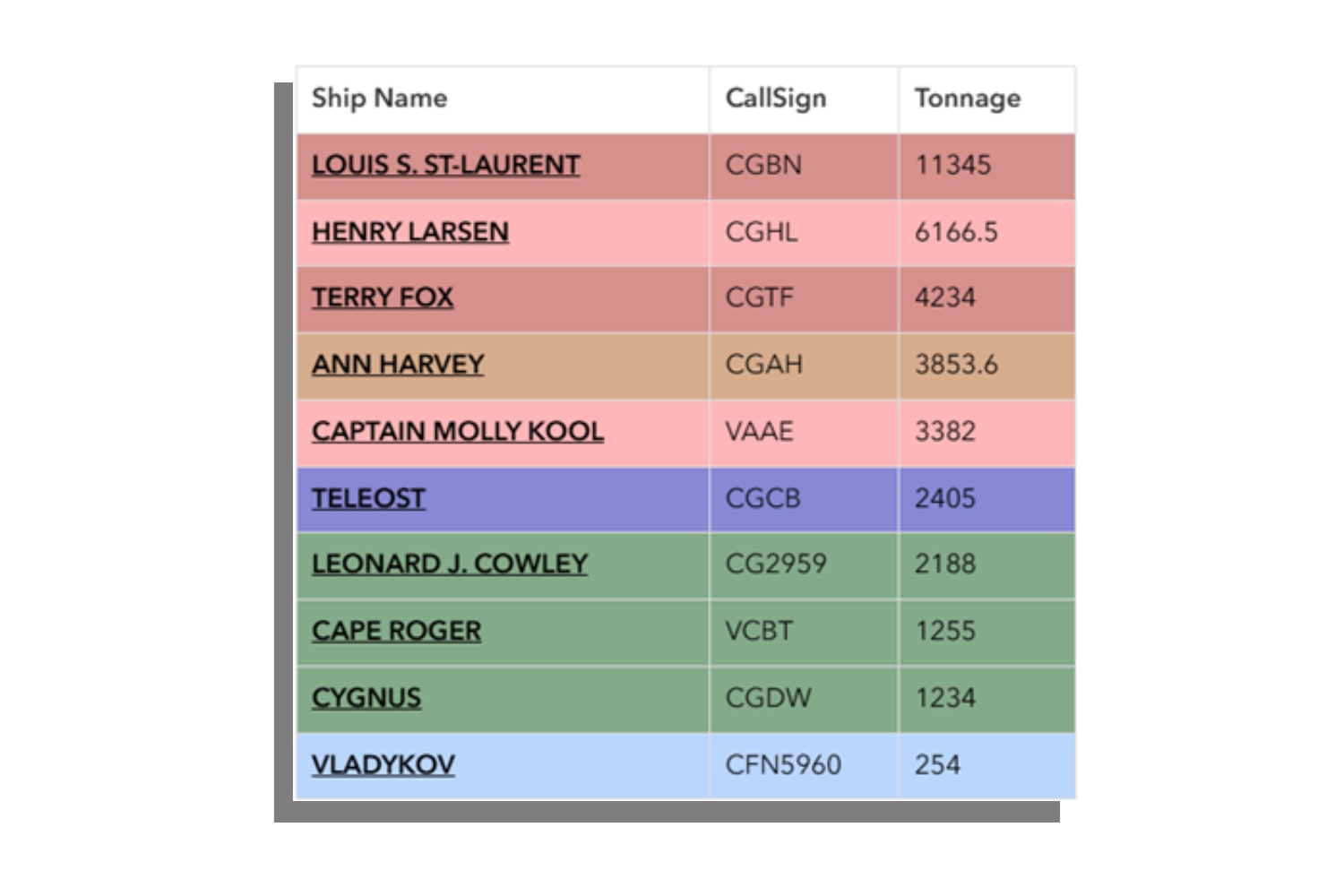
Figure 2: Use Arcade and HTML to present information dynamically based on attribute values or categories. Here, the colour of each row in the table corresponds to the ship’s type.
Arcade can also colour tables, lists or text dynamically based on attribute values or categories. In the example shown, the ships listed are assigned to a specific port to which the popup belongs. The ships are identified by name in a table, which contains each of their call signs and gross tonnage as separate columns. The colour of each row identifies ship type, such as heavy icebreaker in red, or science vessels in blue.
These same colours are applied in the following example of an Arcade popup element list, which has also been formatted with HTML to identify ships assigned to a specific port. A count of the ships is presented along with information about each vessel. Dynamic colours are used to help identify the ship type.

Figure 3: Use Arcade to add detail and dynamism to a list within a popup. In this list, for example, colour has been added to each ship’s callsign to identify the ship’s type. Dark red indicates a heavy icebreaker, pale red indicates a medium icebreaker, dark gold identifies a high-endurance multi-tasked vessel, and so on.
Add bar graphs to your popups to help users cross-reference data
An Arcade popup element can also be formatted to present a horizontal or vertical bar graph. This is a different option from the popup chart element and is an easy configuration option that you can use to graph numerical attributes from the attribute table.
An Arcade popup element can use a dictionary to organize attributes from a related dataset, such as from a feature class of ships that are using that specific port. It provides a much larger array of options through which a bar graph can present information in a popup. The titles and headings of each bar can be individually formatted, the length of the bar can be modified and the colour of each bar can be dynamically changed to represent corresponding attribute values or categories, all using HTML.
In our example, a horizontal bar graph is graphically depicting the gross tonnage of individual ships assigned to a specific port to which the popup belongs. Each bar is dynamically coloured, using the same colour types used in the earlier list and graph example, to depict each type of ship at that port.

Figure 4: Use Arcade to add bar graphs to your map’s popups, then use it to add colour and vibrancy to those graphs.
Be aware: Arcade popup elements work differently depending on where you are in ArcGIS
One of the advantages of Arcade is that the code is designed to work across the ArcGIS ecosystem. There are some exceptions to this rule, and popups are one of them.
An Arcade popup element written in ArcGIS Online uses the latest version of the ArcGIS API for JavaScript that enables it to format dictionaries with HTML code to build specific elements like a multi-column table or a bar chart. But ArcGIS Pro, ArcGIS AllSource and ArcGIS Enterprise may be using an earlier version of the ArcGIS API for JavaScript, and in some cases a different rendering engine; because of this, they may not currently have the capability to render advanced charts and tables built in ArcGIS Online. However, they will continue to work in ArcGIS Online, even if these programs can’t currently render them.
Learn more about how to augment your apps with Arcade
Got more questions about Arcade? As Esri-certified GIS instructors familiar with Arcade, I and my colleagues can help guide you through fundamental programming concepts and how to leverage Arcade to its fullest. With an instructor in your corner, you’ll get personalized answers to your questions, help with hands-on exercises and access to ArcGIS expertise that can’t be beat.
Currently, we host two courses on Arcade. First, start with our half-day introduction, ArcGIS Arcade: Join the Playground!; then, continue on to our more advanced two-day course, Get Started with ArcGIS Arcade. In the latter course, you’ll see examples of seven common Arcade profiles in action and discover Arcade community resources.