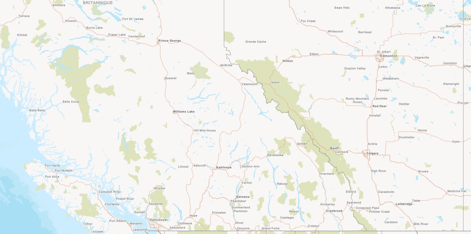
Powering Canadian Mapping: Accessibility and Utility Basemaps Released
Get ready to map Canada like never before! The Community Map of Canada has released two new incredible basemaps, designed to enhance your mapping workflow. The Grey Accessible / Accessible (Gris) basemap style is designed with accessibility in mind and the Neutral Utility / Services Publics (Neutre) basemap style provides a clean and minimalist backdrop. These exciting new styles built from authoritative Canadian data offer more options, ensuring your projects have the context they need.
At the Community Map of Canada, we are constantly exploring new ways to meet the evolving mapping and GIS needs of our users. Our six main basemap styles, built from authoritative Canadian data, serve many purposes, but we found through user feedback that there is a need for a broader range of options, tailored to diverse mapping requirements, prompting the development of additional custom styles.
Recognizing the practical importance of accessibility and utility mapping, we chose these styles as the focus of our initial basemap style expansion:
In this blog, we will dig into the process behind the creation of these new basemap styles and showcase the end results giving you the potential to elevate your own mapping projects.
Designing a Basemap for Everyone
Designed with accessibility as the primary focus, the Grey Accessible basemap style was created to help you create inclusive maps ensuring that everyone can explore and understand the Canadian landscape with ease.
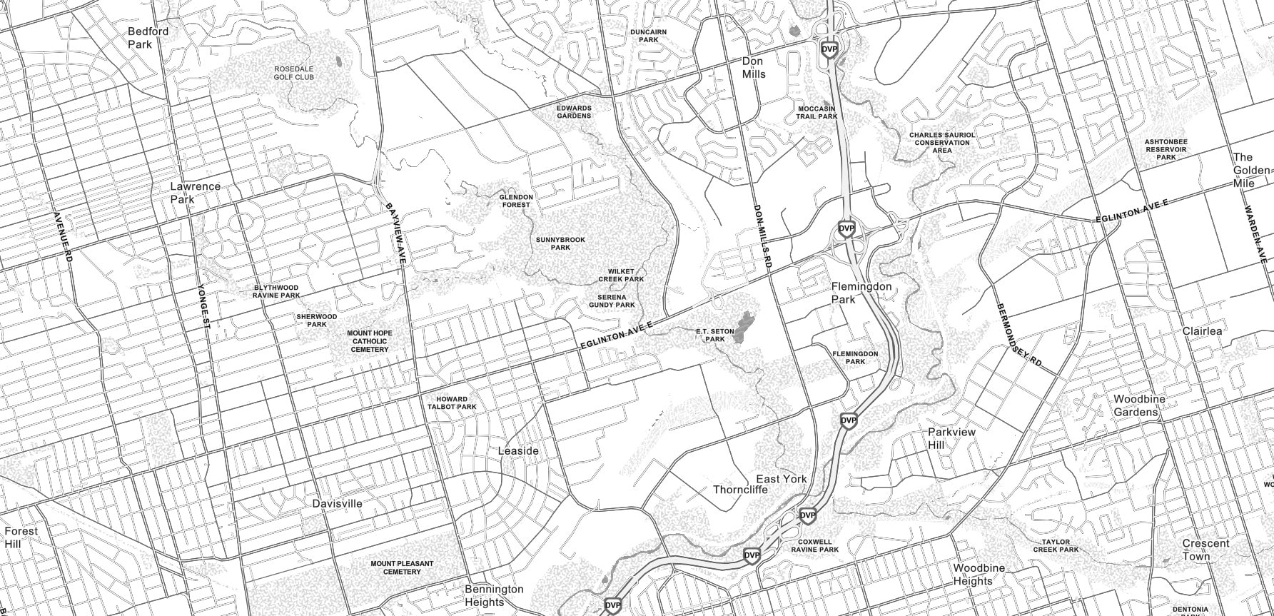
The Grey Accessible basemap style.
Exploring Accessibility Standards
In order to create an accessible basemap, we built the Grey Accessible basemap style to meet the requirements/standards of the Canadian WCAG (Web Content Accessibility Guidelines) AA. Guided by these accessibility standards, we adhered to a 4.5:1 contrast ratio between solid colors and non-text elements (AA) and a 3:1 ratio for user interface components. This focused us to create a map design that prioritizes readability, utilizing a clear visual hierarchy, with higher contrast, enlarged labels and label halos.
The Accessibility Basemap Style Design
The Grey Accessibility basemap style features a colour-blind safe palette focusing on high contrast between different map elements, achieved through dark outlines around features and the strategic use of textures. Enhanced readability was achieved through larger font sizes and the use of text halos.
The Grey Accessible basemap style showcasing high contrast map elements.
Simplicity and clarity were major themes in the development of this basemap style. Essential layers were prioritized with the removal of trees, parking lot lines and most surfaces for a simple, clean appearance. Scale ranges were adjusted to accommodate legibility across all zoom levels. Building footprint colour was adjusted, with a darker outline to improve their visual distinction. Finally, trails were redesigned with larger, darkened labels and a white halo around trail symbology for enhanced visibility over water.
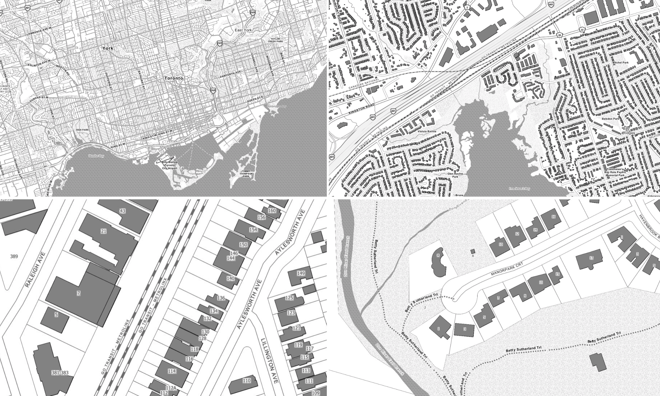
The Grey Accessible Basemap Style at various zoom levels.
With its enhanced contrast applied to map elements and optimized labeling, the Grey Accessibility basemap style provides an inclusive cartographic option for our Canadian basemaps.
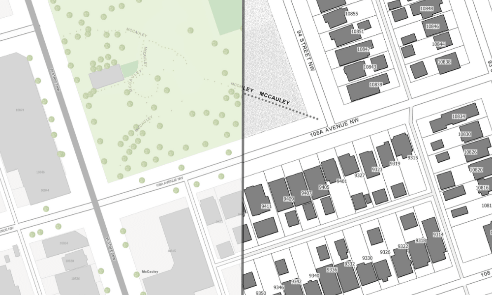
Comparison of the Topographic basemap (left) with the Grey Accessibility basemap style (right) at the neighbourhood scale.
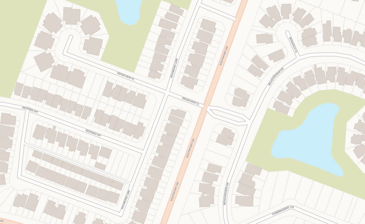
The Neutral Utility Design Approach
The Neutral Utility basemap style required a different design approach as there is no one size fits all when it comes to the world of utility mapping. We focused on designing a versatile basemap to meet a broad range of needs. This led our design efforts to create a simplified basemap with a neutral colour scheme and uncluttered backdrop, allowing the thematic utility content to shine.
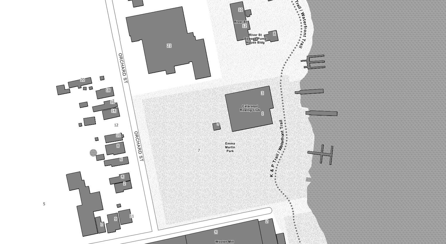
The Neutral Utility basemap style.
Key Elements of Consideration for a Utility Basemap
The design of the basemap style for utility mapping was grounded in comprehensive research and analysis of user feedback. This insight inspired the basemap design that establishes a clear visual hierarchy, prioritizing the utility content while providing context with low saturated colours, minimal labels and details and the removal or reduction of features.
The Utility Neutral Basemap Style Design
In its design, the Neutral Utility basemap style implements a simplified cartographic design, incorporating a custom-designed, low-saturation color palette that complements the underlying greyish-yellow land base.
The Neutral Utility basemap style showcasing the neutral colour scheme and minimal labelling and reduction of layers.
Simplicity and clarity also served as the core design principles guiding the development of the Neutral Utility basemap style. Using the neutral colour palette as a base, key layers, like buildings, parcels and roads, were brought to focus. To create a clean and refined basemap, layers such as trees, address points, trails, ferry lines, neighborhoods and other detailed features (such as sports fields) were removed. The elimination of the hillshade layer brought about the most significant cartographic change. Ultimately, this design change was complemented by the removal of various placename and point of interest labels such as parks, lakes, airports and neighbourhoods.
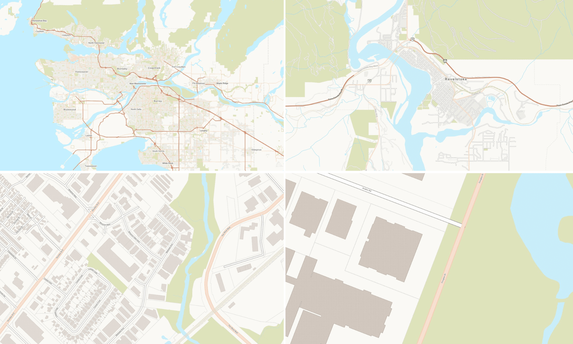
The Neutral Utility basemap style at various zoom levels.
With its simplified style, the Neutral Utility basemap style offers a functional and effective cartographic tool for today's utility professionals.
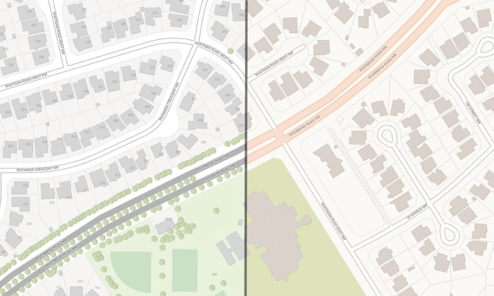
Comparison of the Topographic basemap (left) with the Neutral Utility basemap style (right) at the neighbourhood scale.
Level Up Your Maps with the New Custom Basemap Styles
Start exploring the possibilities with the two new basemap styles today! The basemap styles were both developed to be used for overlaying other layers or as a stand-alone reference map. You can integrate these basemaps into your organization by adding them to a custom basemap gallery to facilitate web map creation across your team.
Created with the Vector Tile Style Editor, these two new basemap styles are just the beginning! We are excited to continue developing and expanding our basemap options to meet your mapping needs. Stay tuned for more styles to come!
For more information about the Community Map of Canada, please visit our website.