Get a view of the world from above using satellite imagery in ArcGIS
Watch the world from above! Learn how to work with satellite imagery to convert pictures into meaningful products.
This summer there were several major weather-related disasters, including “flooding in Toronto and elsewhere in southern Ontario, the Jasper wildfire, Calgary hailstorm and flooding in Québec regions” (Global News). With each of these events, authorities need to quickly assess the current situation and potentially predict what neighbouring areas will get affected next, such as with a wildfire.
To make informed decisions about disaster preparation, response and recovery, authorities need data. One example of data that is useful during natural disasters is satellite imagery, which can be used to identify areas that are burning or have already burnt, or areas that have been flooded. Depending on how often the satellite revisits the location, known as the temporal resolution, it may be possible to measure the change over time of the phenomenon at play. For example, Maxar’s WorldView-3 satellite has a revisit time of one day, making it possible to measure how quickly a wildfire or flooded area may be expanding.
There are several challenges in working with imagery, including cost, managing large amounts of files and data, and the difficulty in classifying the imagery into a meaningful product or result.
Challenge #1: Cost
Two types of costs related to satellite imagery are the time required to process it into a usable product for end users, and the price to acquire the imagery from the satellite vendor. For example, the images may first need to be orthorectified, pan-sharpened or mosaicked together if there are multiple scenes, all of which take time and resources. ArcGIS Pro has raster products and raster functions that will dynamically manipulate the data for you.
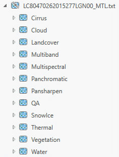
A Landsat 8 metadata text file turns into a raster product in ArcGIS Pro, where band combinations are applied automatically through the red, green, and blue visual channels when displayed in a map.
Raster products allow you to visualize your satellite scene in a number of ways right from the Catalog pane using preset band combinations. Raster functions are similar to geoprocessing tools but will process the source data very quickly in the memory of Pro rather than creating a whole new output on disk.
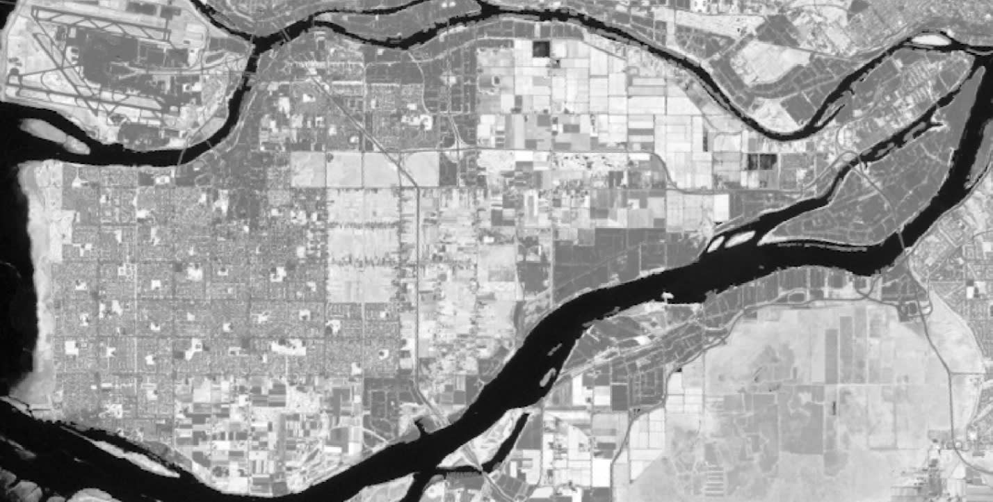
An NDVI was calculated on the Landsat data using a raster function. Processing time: <1 sec. Additional file storage on disk: 0 KB. In the image above, the more vegetated whiter areas are mostly fields and forests while the darker areas are the built-up urban environment.
As for the cost to acquire imagery, depending on requirements such as the spatial resolution, it may be possible to purchase from commercial vendors like Maxar, or to download for free in the case of Landsat.
Challenge #2: Data management
Often the imagery files are quite large. One WorldView-2 scene that I have is 12GB in size. So, if neighbouring areas or multiple scenes over time are needed it not only becomes challenging to store the data but also to process it into derivative products, like with a landcover classification. The raster functions in ArcGIS Pro will help with minimizing the creation of physical outputs for derivative products and the mosaic dataset will help with dynamically mosaicking neighbouring images together. It will also provide you with a way to more easily handle overlapping images from different points in time.
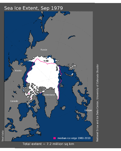
This animated GIF was created from a mosaic dataset pointing to annual images showing the minimum sea ice extent in the Arctic. Although the individual images overlap each other, the mosaic dataset makes it possible to sort the overlapping images, in this case based on time, and together with the time slider temporal animation becomes possible.
Challenge #3: Classifying imagery
A satellite image may look like a pretty picture where we can see water, trees and houses, but in reality, the image is made up of millions of pixels whose values represent light reflectance from some part of the electromagnetic spectrum. Therefore, to understand what area is burnt or underwater, the image pixels need to be categorized, or classified. There are several methods used to classify the data, including unsupervised and supervised approaches, and they are generally time-consuming and require lots of skill. The difficulty and repetitiveness of classifying imagery has led to the use of Deep Learning as one type of supervised classification. ArcGIS Pro has several image classifier algorithms available, as well as a number of pretrained Deep Learning packages for more automated workflows.
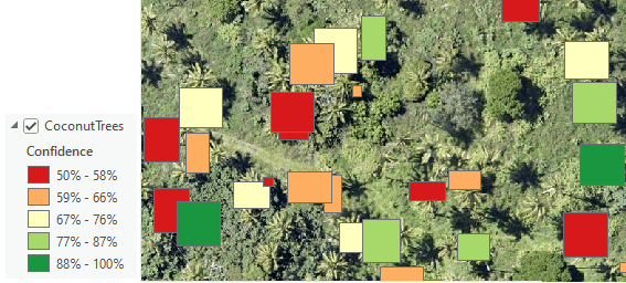
A Deep Learning model was initially trained to find coconut trees. When the model was then used to detect all other coconut trees in the image it returned its results with a confidence indicator. Unfortunately, it missed many trees due to the author’s poor training abilities.
To learn more about how to work with imagery data in ArcGIS:
- Check out the ArcGIS documentation.
- Take an instructor-led training course to learn more about raster functions, mosaic datasets and publishing imagery to the web.
- Take an instructor-led training course to learn more about image classification.
- Try out a tutorial on classifying objects using Deep Learning.
Want to stay informed about all the latest training opportunities at Esri Canada? Visit Esri Canada’s Communication Preference Centre and select the “Training” checkbox to get a monthly roundup straight to your inbox.