Building safer school routes with ArcGIS Online
How can planners and school boards make walking and biking routes safer for students? This blog post shows how ArcGIS Online turns open data into actionable insights using ModelBuilder, Arcade and tessellation. Learn step-by-step techniques to analyze collision data and visualize safety risk around schools.
Every day, children walk or bike to school. By analyzing traffic collisions near elementary schools, planners and school boards can gain insight into where safety improvements may be needed.
At the 2025 Esri Canada User Conference, we demonstrated how spatial analysis turns open data into targeted action for safer school routes.
In this blog post, we’ll walk through the key techniques behind that demo using ArcGIS Online Map Viewer, so you can try them yourself.
Demo context and data
The goal was to identify where safety interventions should be prioritized by measuring risk around elementary schools and connecting that risk to student volumes.
The demo focused on two layers from Open Ottawa (Ottawa's open data hub):
- Schools
- Filtered to elementary schools
- Note: Arbitrary attendance values were allocated to elementary schools for analysis.
- Traffic Collision Data
- Key fields:
- X and Y Coordinate for location
- Maximum Injury (highest injury level in the collisions)
- Four fields describing the number of affected parties (vehicle, pedestrian, bicycle and motorcycle)
- Key fields:
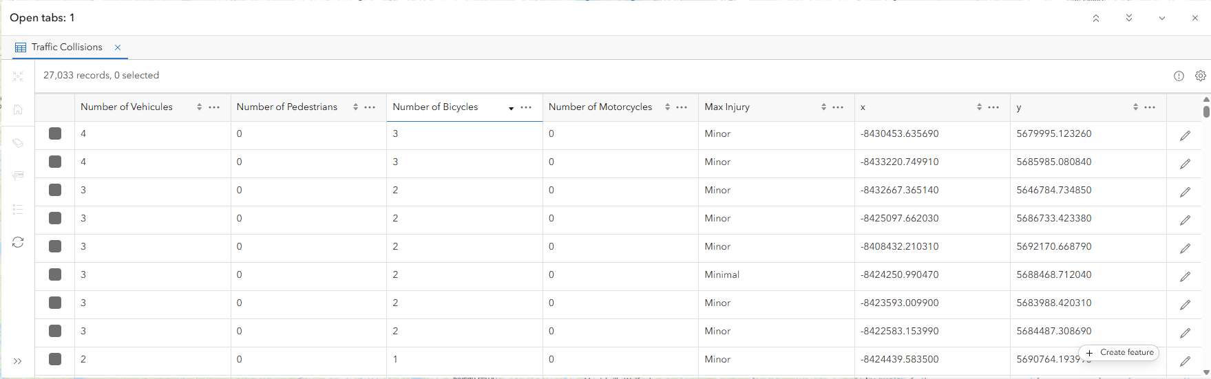
Snippet of Traffic Collision Data layer
Part 1: ModelBuilder in Map Viewer
ModelBuilder in ArcGIS Online Map Viewer lets you design and run multi-step spatial analyses entirely in the browser, no coding required.
Workflows can be built once and reused year after year, ensuring consistency and saving time for recurring analyses.
The model in this demo had four major steps:
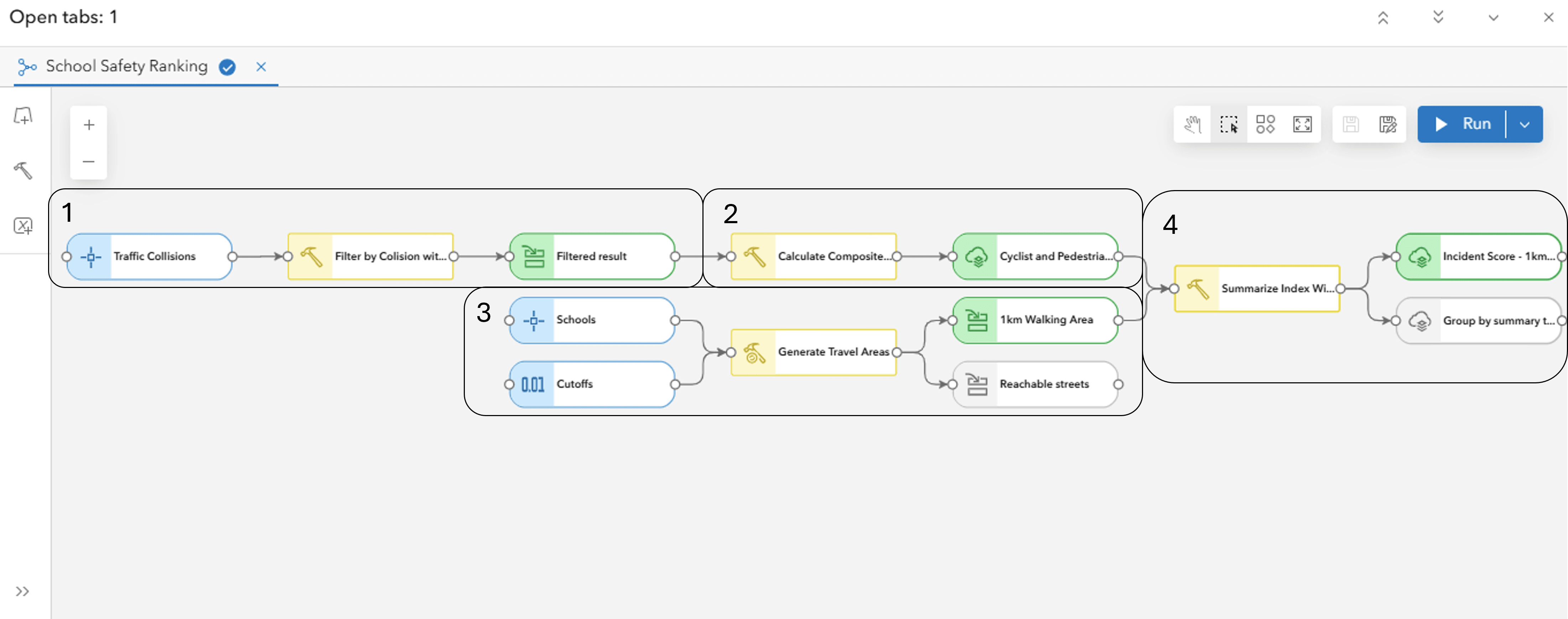
ModelBuilder workflow in Map Viewer
Step 1: Filter collisions
Filter collisions to focus on incidents involving pedestrians and cyclists using the Filter By tool.

Filter By settings on the Traffic Collision Data layer
Step 2: Calculate a safety risk score
Calculate a safety risk score by counting these incidents and applying extra weight for injuries and fatalities using the Calculate Composite Index tool.

Composite Index settings for the filtered collisions
Stylised result layer:
Configured and stylised Cyclist and Pedestrian Traffic Collisions layer
Step 3: Generate walking areas
Create a 1 km walking distance around each school (a typical range for students) using the Generate Travel Areas tool.
 Generate Travel Areas settings on the Schools layer
Step 4: Summarise collisions
Aggregate collisions and their risk scores (Step 2) into the 1 km walking areas using (Step 3) using the Summarize Within tool.

Summarize Within settings on the results from steps 2-3
Stylised result layer:
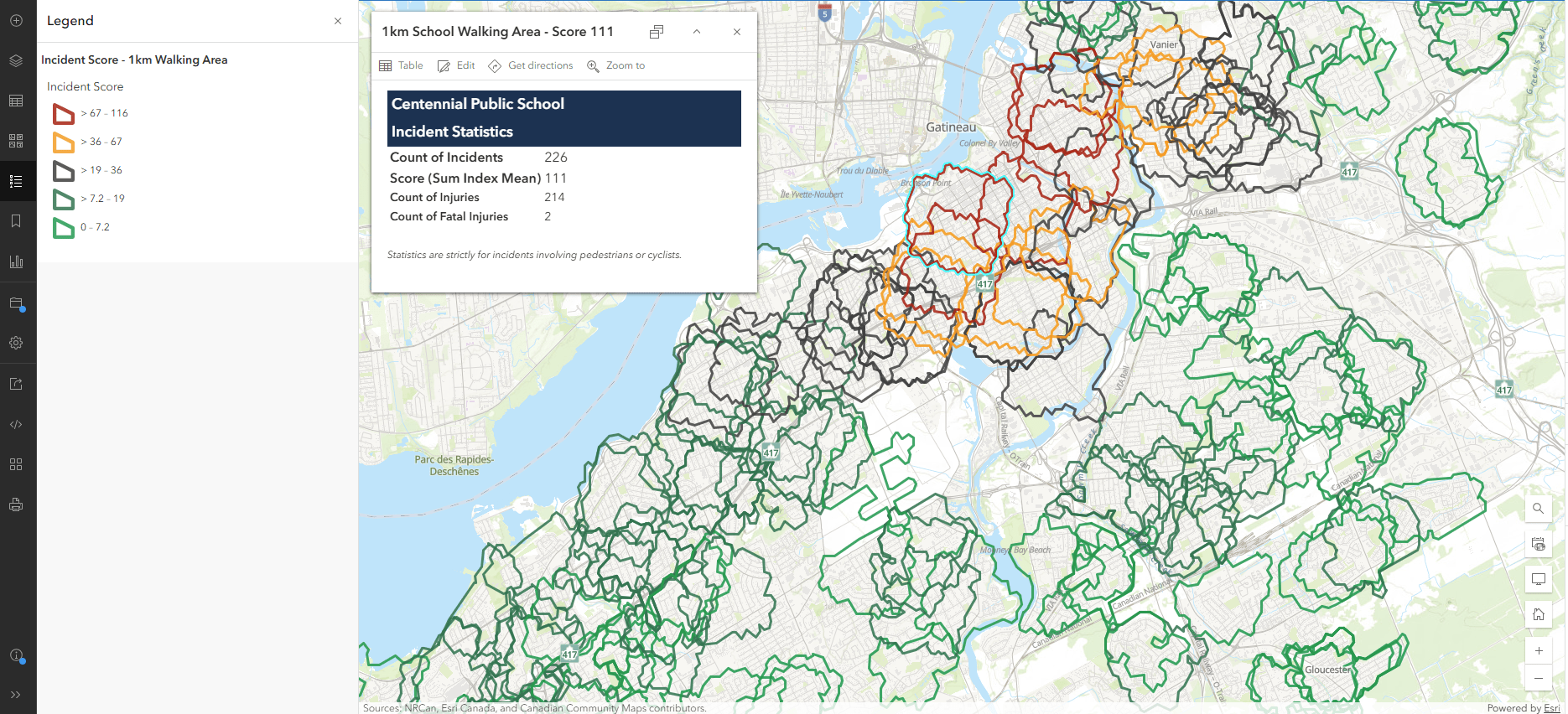
Configured and stylised 1 km School Walking Area layer
Result: This converts raw collision data into a clear measure of safety risk for each school and becomes a repeatable process that teams can rerun as new data is published.
Get started with ModelBuilder in ArcGIS Online
Part 2: Animated Symbology with Arcade
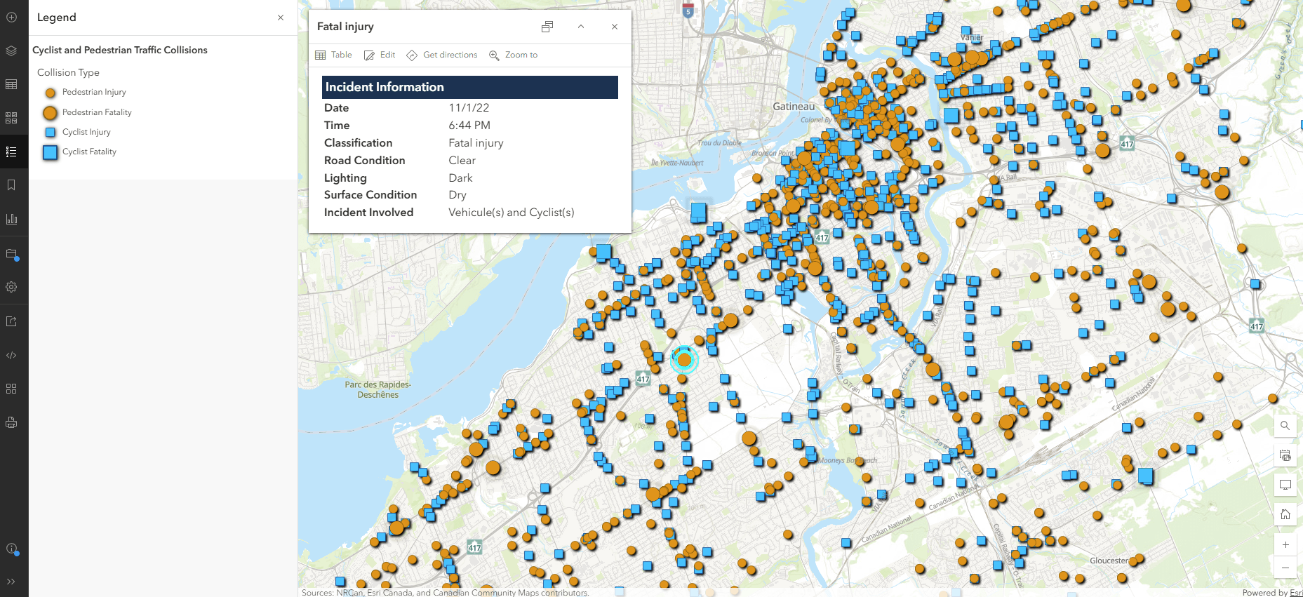
To ensure severe collisions stand out, we used animated symbology powered by Arcade. Fatal pedestrian or cyclist collisions pulse on the map, immediately drawing attention.

Animated symbology on the Cyclist and Pedestrian Traffic Collisions layer
Step 1: Create custom attributes using an Arcade expression in the Styles pane.

Custom Expression: Collision Type on the Cyclist and Pedestrian Traffic Collisions layer
The code categorizes collisions into four types:
- Cyclist Fatality
- Pedestrian Fatality
- Cyclist Injury
- Pedestrian Injury
A When clause then ensures fatalities are prioritized.
Code:
var cyclist = $feature.Num_of_Bi
var pedestrian = $feature.Num_Of_Ped
var fatal = $feature.Fatalities
var injured = $feature.Num_of_Inj

When (cyclist > 0 && fatal > 0, "Cyclist Fatality",
 pedestrian > 0 && fatal > 0, "Pedestrian Fatality",
 cyclist > 0 && injured > 0, "Cyclist Injury",
 pedestrian > 0 && injured > 0, "Pedestrian Injury", null)
Step 2: Configure basic point symbols for injuries using Types (unique symbols) on the Cyclist Injury and Pedestrian Injury.

Cyclist and Pedestrian Injury symbol settings
Step 3: Configure animated vector point symbols on the Cyclist Fatality and Pedestrian Fatality.

Cyclist and Pedestrian Fatality animated symbol settings
Secret Step 4: Add a Drop Shadow in the Effects tab, for a polished look.

Drop Shadow settings
Result: The dynamic visualisation turns static data into a compelling story, making critical points stand out.
Part 3: Tessellation for Pattern Detection
Point data can obscure spatial patterns when dense or unevenly distributed. Tessellation normalizes data across space and H3 hexagons offer consistent geometry well suited for spatial analysis.
Step 1: Use Generate Tessellation with the 1 km Walking Areas (see Part 1 - Step 4) as the extent, in the Analysis tab.
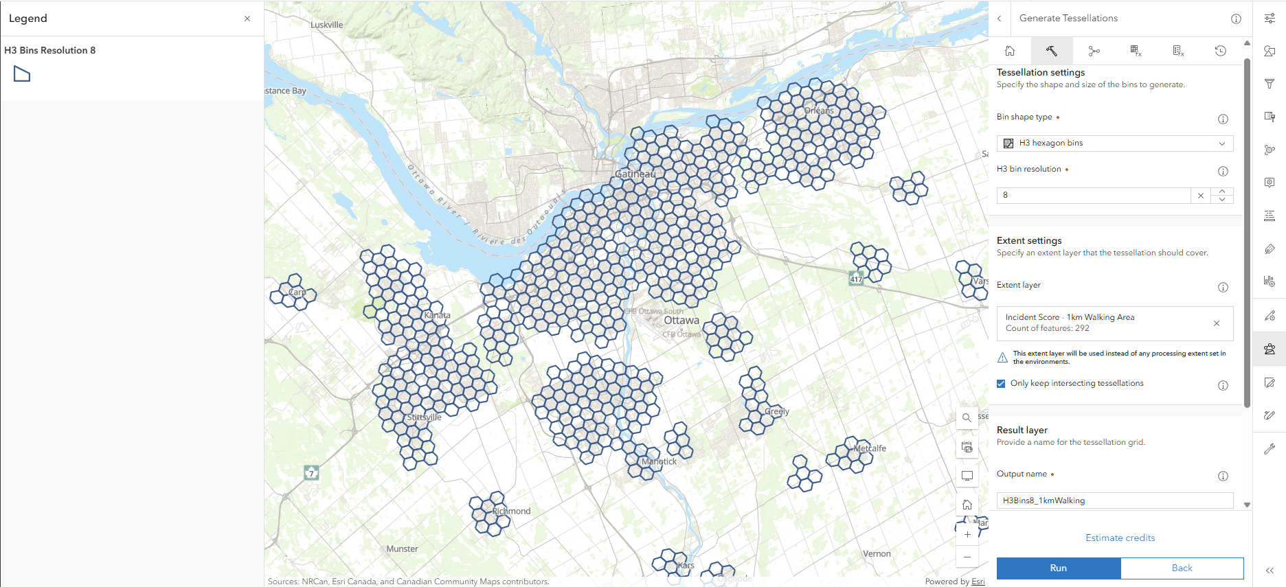
Generate Tessellation tool settings
Step 2: Use Summarize Within to aggregate collisions and risk scores (Cyclist and Pedestrian Collisions layer) into each hexagon.

Summarize Within tool settings
Step 3: Use the Summarize Within to aggregate count of students walking or biking to school into hexagon bins (step 2).
Result: Hexagon bins with aggregated collisions risk scores that could be symbolised to make clusters clear immediately.

Relationship style settings
Bringing it together
ModelBuilder for structured analysis, Arcade for dynamic symbology and tessellation for pattern detection, contributed to a comprehensive view of school route safety.
When integrated into an ArcGIS Dashboard, these layers enable planners to query where walking or biking rates intersect with safety risks.

ArcGIS Dashboard highlighting elementary schools by decreasing pedestrian and cyclist safety
ArcGIS Online provides tools to move beyond visualisation and deliver actionable insights. From repeatable workflows to advanced styling and spatial analysis, these capabilities highlight patterns that may inform future decision making.
Now it’s your turn to try these techniques!