Five tips for creating effective symbols and maps in ArcGIS
There are so many resources out there to help us make better maps. The sheer volume can feel overwhelming at times! Read on for a compilation of Esri Canada certified ArcGIS instructor Melanie Meeking’s favourite links to help make some sense of it all.
A lot of decisions need to be made when you’re building a map, whether it’s for print or the web. Maps are meant to communicate a message, and one of the most important things we do when creating a map is make decisions about symbology. You might choose to vary the size, shape or colour of your symbols to distinguish between feature types or values. The symbols you choose need to be clear and help share your message, but it’s even better when your maps are also nice to look at.
We combine science with art when we make maps. With ArcGIS we can leverage advanced symbology techniques to create interesting, authoritative visualizations. Are you looking to jazz up your maps with some effective and exciting symbology techniques? Here are five ways you can do that.
Create a visual hierarchy
Maps typically have two different kinds of layers: base maps and operational layers. The base map provides reference information for the map reader, whereas the operational layers show the data that is actually the point of the map. As a mapmaker, we want to draw attention to the operational layers in the map—these are the features that are communicating the map’s purpose. We can use symbology to situate each layer in a visual hierarchy to accomplish this—drawing more attention to the layers at the top of the hierarchy by using visual techniques to draw the reader’s eye. This blog post describes visual hierarchy in more detail.

Clearly display overlapping polygons
John Nelson always has great ideas for symbolizing data. I highly recommend browsing through his blog posts for some very cool ideas on presenting your geographic data. One example to get you interested: it can be challenging to effectively present overlapping polygons in a way that is clear to the reader. In this blog post, John Nelson presents a number of symbology options for this common situation—check it out. Don’t forget to check out the rest of his blog as well for other great mapmaking and symbology techniques!

Use feature blend and layer blend
One of the techniques featured in the abovementioned blog post by John Nelson is feature blend. Blend modes have been around for a while (introduced in ArcGIS Pro 2.7), but I think they’re worth their own bullet point. Blending allows you to do just that—blend the features in your layer together (feature blend) or blend those features with the features in the layer underneath them (layer blend). This can achieve some interesting visual effects that will help communicate your message or even just make things look neat. If you’re not already familiar with the layer and feature blend options, check out this video and this blog post for more details.

Incorporate accessibility features
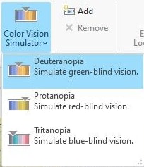
It can be a lot of fun to build interesting symbols for our maps. But before we get too carried away, it’s a good idea to consider how accessible your map is. There are a number of tools and strategies that can be used to help create accessible maps—check out this post with all the details.

Build a concise but descriptive legend
Once we’ve got everything symbolized, we need to communicate with our audience—what do all those symbols mean? Configuring legends can be finicky work, but it’s well worth the time to build a concise but descriptive legend. Check out this series of videos on tidy legends, as well as these tips and tricks for ideas on building great legends.
For more tips and tricks on creating visualizations in ArcGIS, come check out our two-day day instructor-led class on the topic: Mapping and Visualizing Data in ArcGIS. In the class, we chat about symbology as well as labels, and get into details on creating layouts for print as well as web maps. We even talk about working with charts in ArcGIS, working with 3D and creating animations.
Want to stay informed about all the latest training opportunities at Esri Canada? Visit Esri Canada’s Communication Preference Centre and select the “Training” checkbox to get a monthly roundup straight to your inbox.