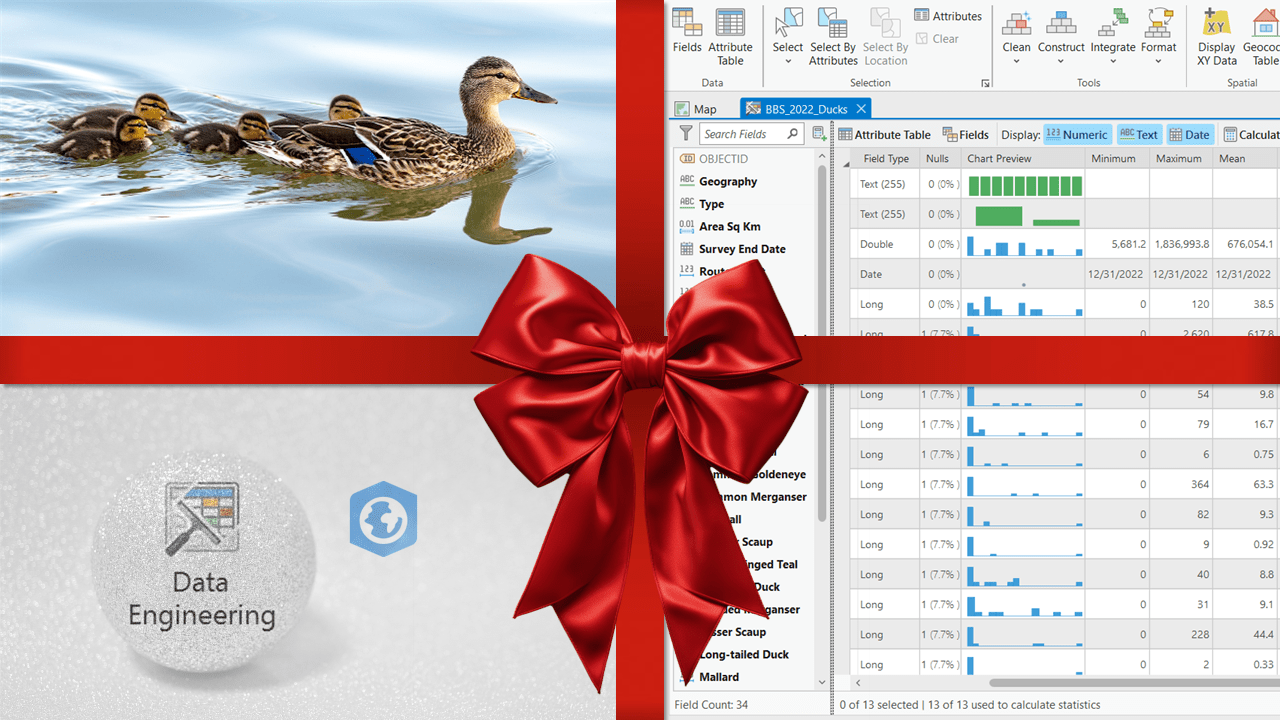
Our gift to you: the ultimate view for organizing your data
Whatever you celebrate this season, unwrap the Data Engineering view to more efficiently explore and visualize your data. You deserve nicely organized data for analysis and mapping.
In GIS, you want all your data set up in an orderly fashion so you can then use their correct spatial locations and attributes in your subsequent spatial analysis and mapping workflows. By organizing your data, you’ll minimize the dreaded garbage-in-garbage-out within your GIS. But assembling your data can often be challenging, messy and time consuming.

Helping you "get your ducks in a row" so your data are prepared and organized for all your GIS workflows.
Introducing the Data Engineering view
Why not open a new view on your data? The Data Engineering view helps you streamline your data exploration and preparation workflows in ArcGIS Pro. Data Engineering is a dedicated view compatible with all feature layers and standalone tables, built right into your favorite desktop GIS powerhouse, and it’s available with all license levels of ArcGIS Pro. That’s right! No additional extensions or licensing, just add your feature classes or standalone tables to a Map view, then select the layer of interest from within the Contents pane. You can open a Data Engineering view from multiple handy locations within ArcGIS Pro:
- The selected layer’s right-click contextual menu
- Data contextual tab
- Analysis ribbon tab
- Fields view
- Attribute Table view
Once you click the Data Engineering button from any of the above locations, you will see the new Data Engineering view, along with a Data Engineering ribbon. You can even open multiple views at the same time because each layer has its own Data Engineering view!
Data exploration—This is where you gain a thorough understanding of the fields and their values in your data. You can view a list of all the fields of interest by field type along with their nulls, chart previews and descriptive statistics. The Data Engineering view automatically generates a chart based on the attribute field’s data type, but you might also want to visualize the data in other types of charts that visualize additional characteristics and relationships. You can quickly calculate and display statistical and data quality metrics of fields as columns in a table to evaluate the quality and distribution of values. What an improvement over sorting within the table and running the Summary Statistics tool for every single field! You can immediately find out the answers to questions on: how many fields are there in this dataset? Does this field contain null values? What is the sum of values for these selected features? What is the average value for all records (or a selection of records)?
Data preparation—This is where you modify and clean data to ready it for the next steps. All of the tools in the Data Engineering ribbon are also accessible through the Geoprocessing pane, but the shortcuts here save you time searching for them. The context-sensitive ribbon provides easy access to Tools in four categories: clean, construct, integrate and format.
- Clean your data by removing unnecessary fields, altering the fields, projecting between coordinate systems, deleting rows, filling missing values or detecting spatial outliers.
- Construct your data by adding and calculating a new field, calculating crude or smoothed rates (e.g., Bayes), calculating geometry attributes, transforming continuous field values by applying mathematical functions, standardizing field values that follow a specified scale, reducing the dimensions of multiple data attributes (e.g., principal components analysis or linear discriminant analysis) or smoothing time series data.
- Integrate your data by appending, joining based on spatial relationships, joining based on common attribute fields, calculating proximity information between features, summarizing within a polygon overlay, summarizing within a specified distance among features, sampling raster values to point data, adding demographic or landscape facts as new fields by enriching the data, or apportioning polygons to summarize numeric attributes in a polygon overlay.
- Format your data by converting temporal or time zone fields, creating a pivot table, transposing fields, reclassifying fields using various reclassification methods (finally, just like what you can do with raster reclass, but for feature layers and standalone tables!) or encoding categorical fields that can support statistical workflows.
Presents!
‘Tis the season to be giving. Allow us to help you tear open Data Engineering with the following resources so that you can better organize your data:
- The documentation: Introduction to Data Engineering—ArcGIS Pro | Documentation
- Videos: Esri Videos: GIS, Events, ArcGIS Products & Industries | Search Data Engineering and Data Engineering: Drive to Analyze - Tech Talks 2022 - YouTube
- Self-paced learning: Data Engineering in ArcGIS Pro | Tutorial Series
- Instructor-led learning: Preparing Data for GIS Applications | Esri Canada